


Rooted in Chicago
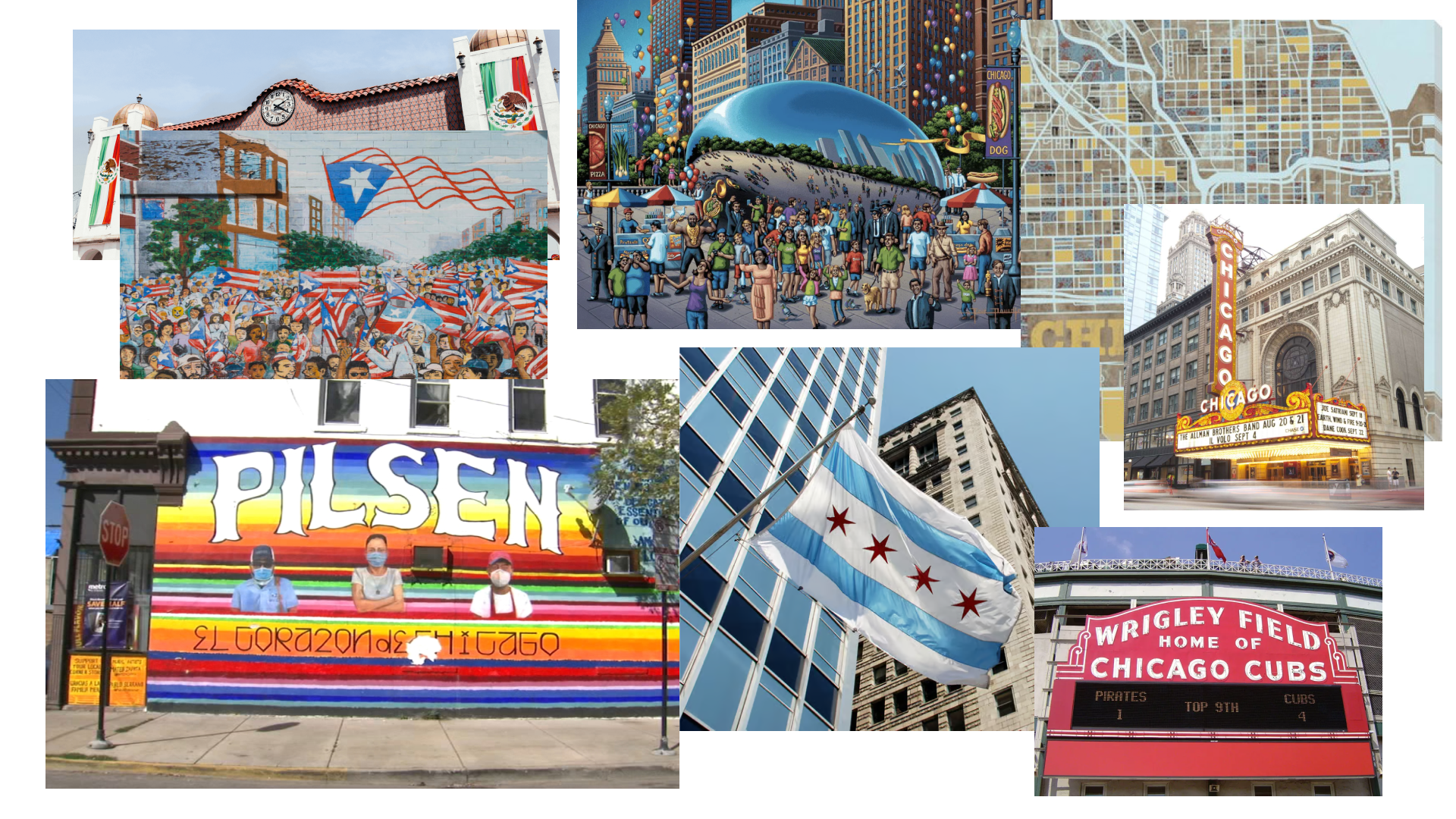
I began by looking at the visual culture that gives Chicago its character. Murals, neighborhood signage, public art, architecture, and familiar civic symbols helped establish a direction rooted in both place and community.
The mood board below brought these references together with Chicago’s street grid, lakefront, skyline, flag, and cultural landmarks. This exploration shaped a visual language that feels expressive, approachable, and unmistakably connected to the city.
Developing the Identity
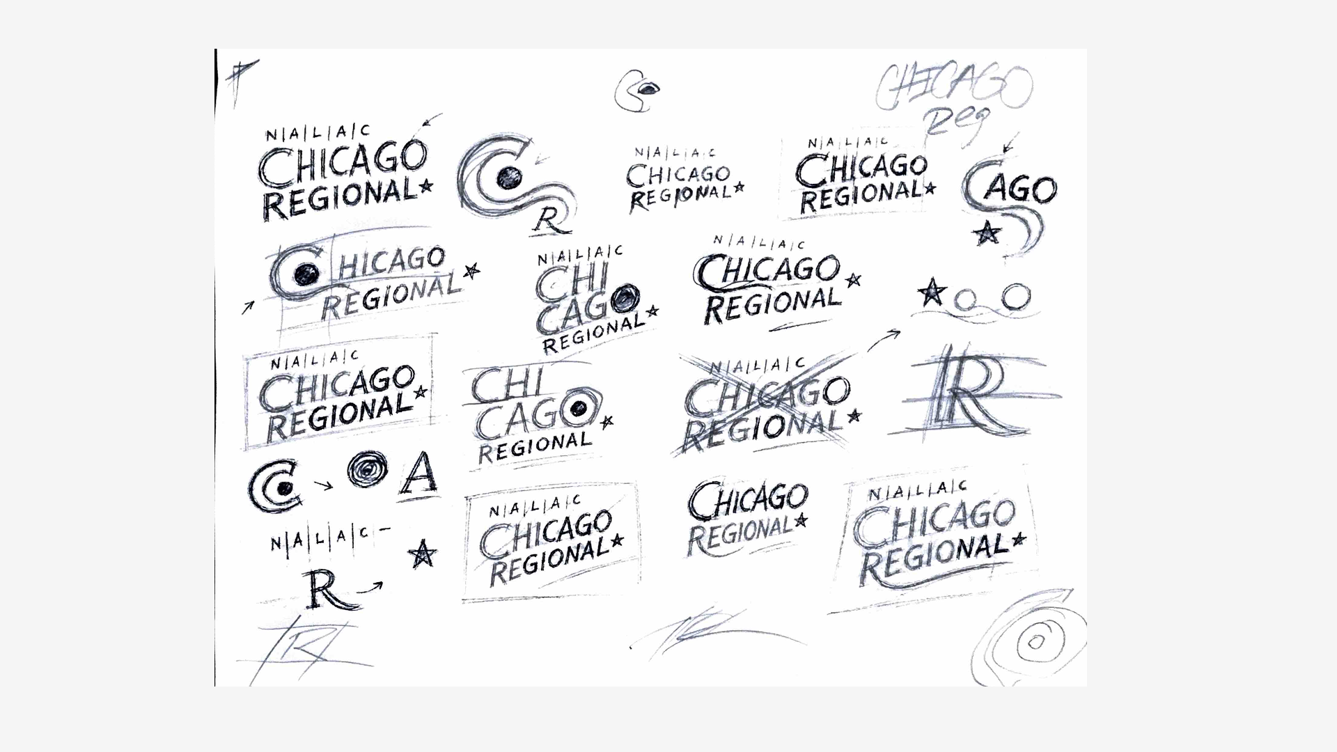
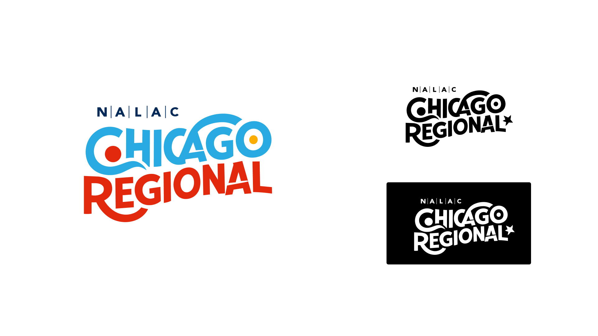
The early sketching process focused on finding a balance between the creative energy of the arts community and the clarity needed for an event identity. I explored organic letterforms, movement, and different ways of integrating recognizable Chicago elements. These studies led to a hand-drawn typographic direction anchored by the Chicago star. Its irregular forms give the identity a human quality while creating a distinctive mark that can remain recognizable across different formats.
Building a Flexible Visual System
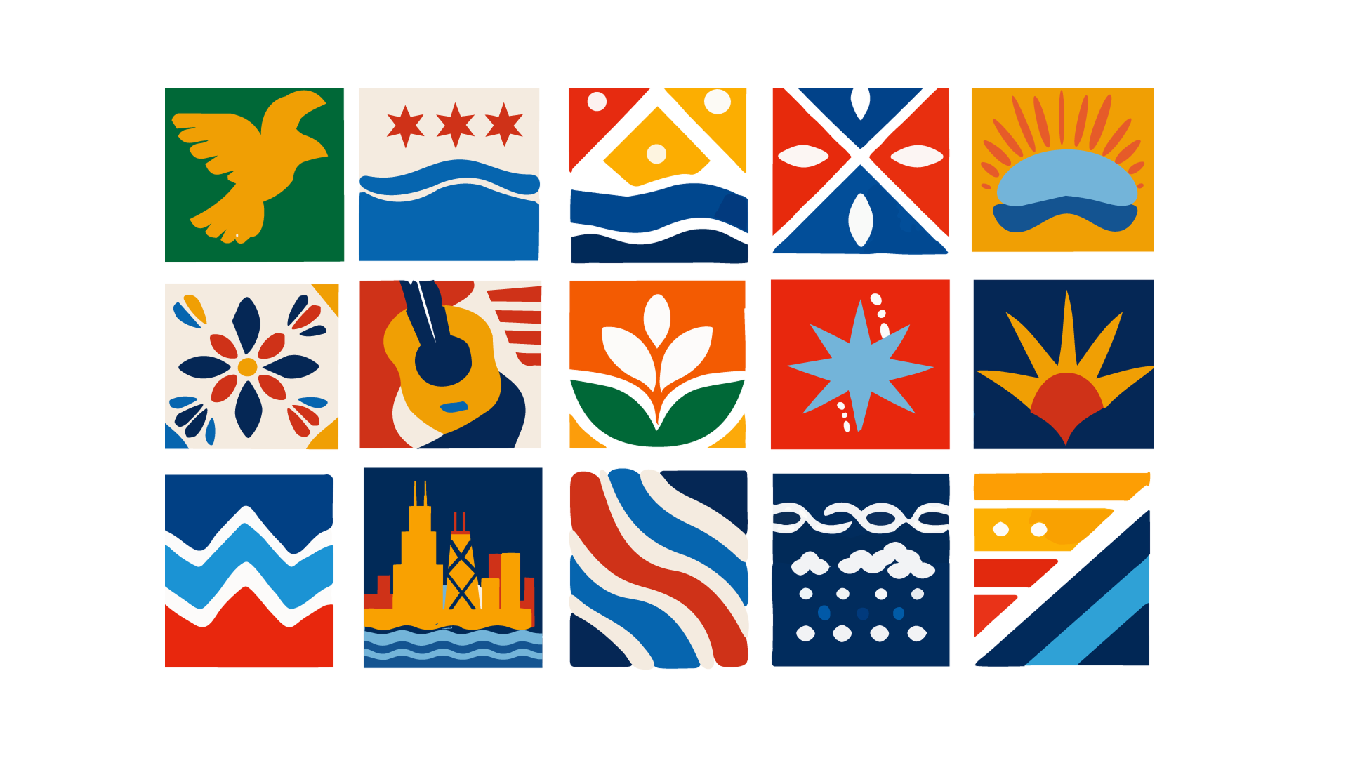
I expanded the identity through a collection of modular illustrations inspired by Chicago and Latine arts and culture. The motifs reference the city’s architecture, lakefront, weather, music, natural environment, and community traditions.
Organizing each illustration within a consistent grid allows the pieces to be rearranged into new compositions while maintaining a cohesive look. This flexibility gives the brand room to adapt across invitations, signage, digital communications, and event environments.
Bringing the Gathering to Life
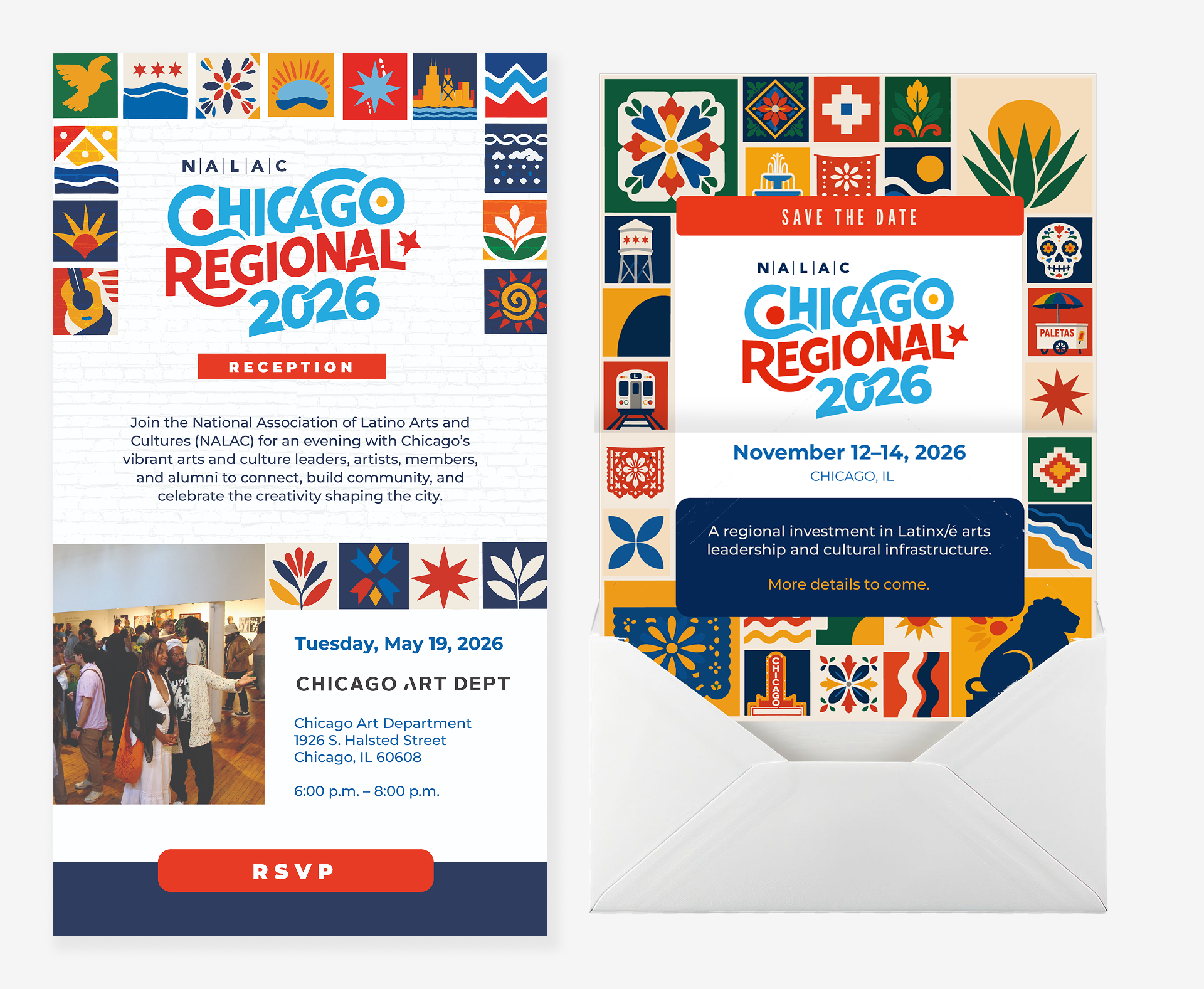
The visual system was applied across invitations and save-the-date materials for both the Chicago Regional gathering and its accompanying reception. The modular motifs create a vibrant frame around the event information while keeping the communication clear and accessible. The applications demonstrate how the identity can shift between celebratory and informational moments without losing its connection to the larger brand.
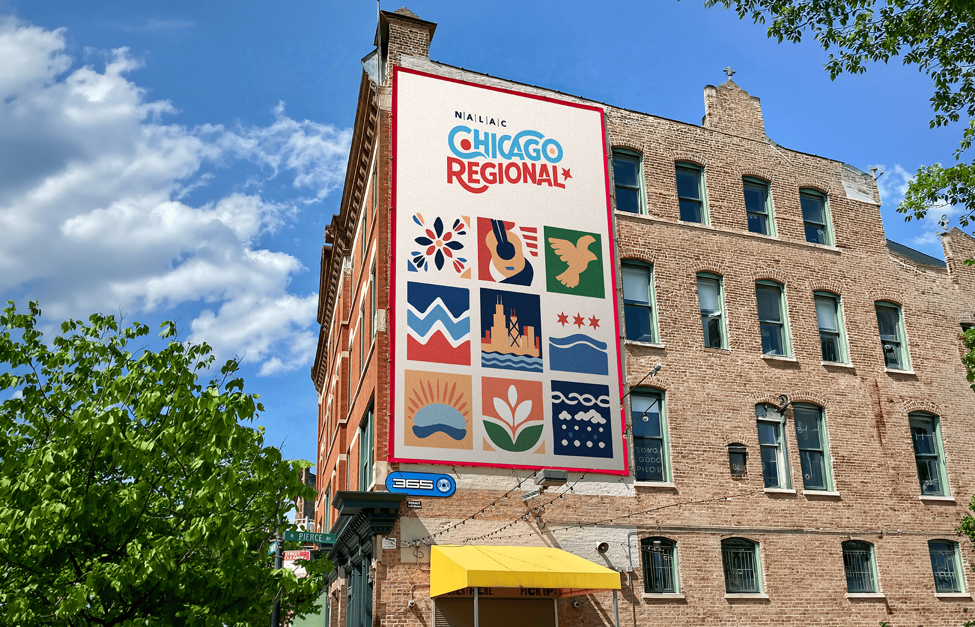
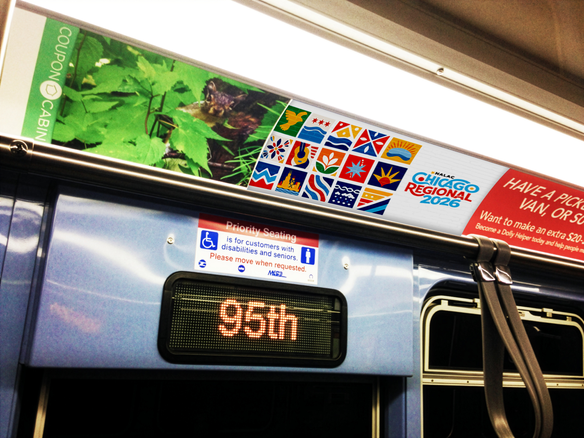
The final identity brings together Chicago’s distinct visual character and the creative spirit of its Latine communities. More than a single logo or event graphic, it creates a flexible system that can grow across platforms while remaining welcoming, expressive, and rooted in place. The project reflects the gathering’s larger purpose: creating space for connection, cultural exchange, and a stronger regional arts community.
